
Infographic
tell a story and present data so that everyone gets it


Themen & Inhalt
- Infographics: Visualize Complex Issues
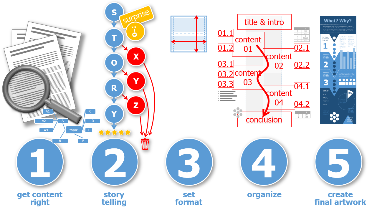
- 5 Steps to an Eye-Catching Infographic
- 1. Get the Content Right
- 2. Tell a Story
- 3. Set the Format
- 4. Organize
- 5. Create the Final Artwork
- Story Telling
- The One and Only Key Message
- Surprise with a Single Headline
- Concentrate on the Key Point
- Guide the Viewer by Structured Content
- Less is More
- Format
- Different Screen Aspect Ration & Social Media Formats
- One Fits Most
- Download Grid
- Fonts
- Colors
- Icons, Cliparts & Graphic Elements
Infographics: Visualize Complex Issues ^
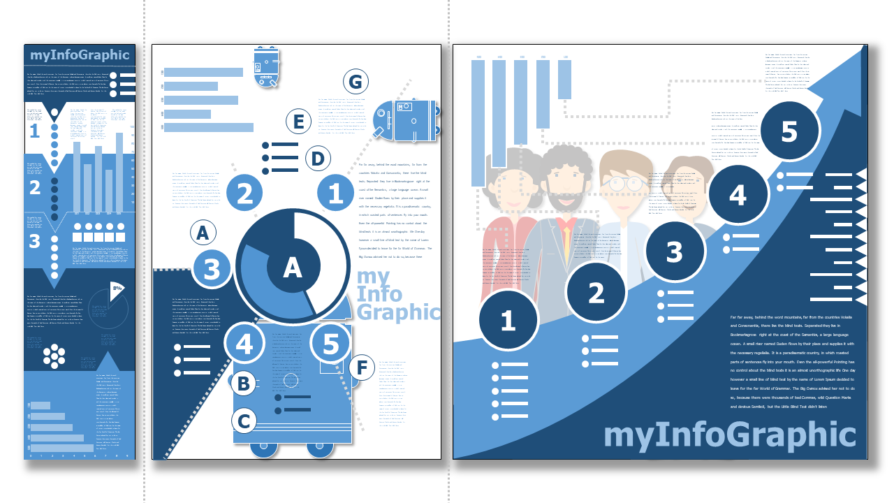
Infographics visualize information, data and processes. They present complicated facts in a clear way, which would otherwise be more difficult for the viewer to understand. So their main task is to instruct and to achieve an "Ah-ha" experience for viewers. This also means that the content can be quickly grasped and understood.
Infographics are very different from a book text page! They usually have little text and focus on graphic elements. These graphic elements are always related to the content and symbolize it without needing text explanations. In this way, graphic elements in infographics replace the text.
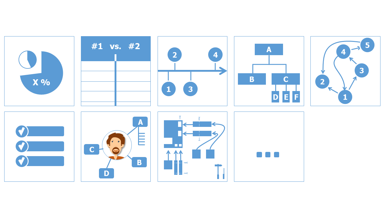
Infographics can be found in presentations, info brochures at explanatory websites and videos. There are many possibilities of inforgraphics:
- statistical results
- comparison of products, statements, information
- temeline of events, milestones
- hierarchical representations like organizgrams
- process flow
- checklists
- personal information e.g. as curriculum vitae
- construction plans e.g. of furniture
- ... and many more
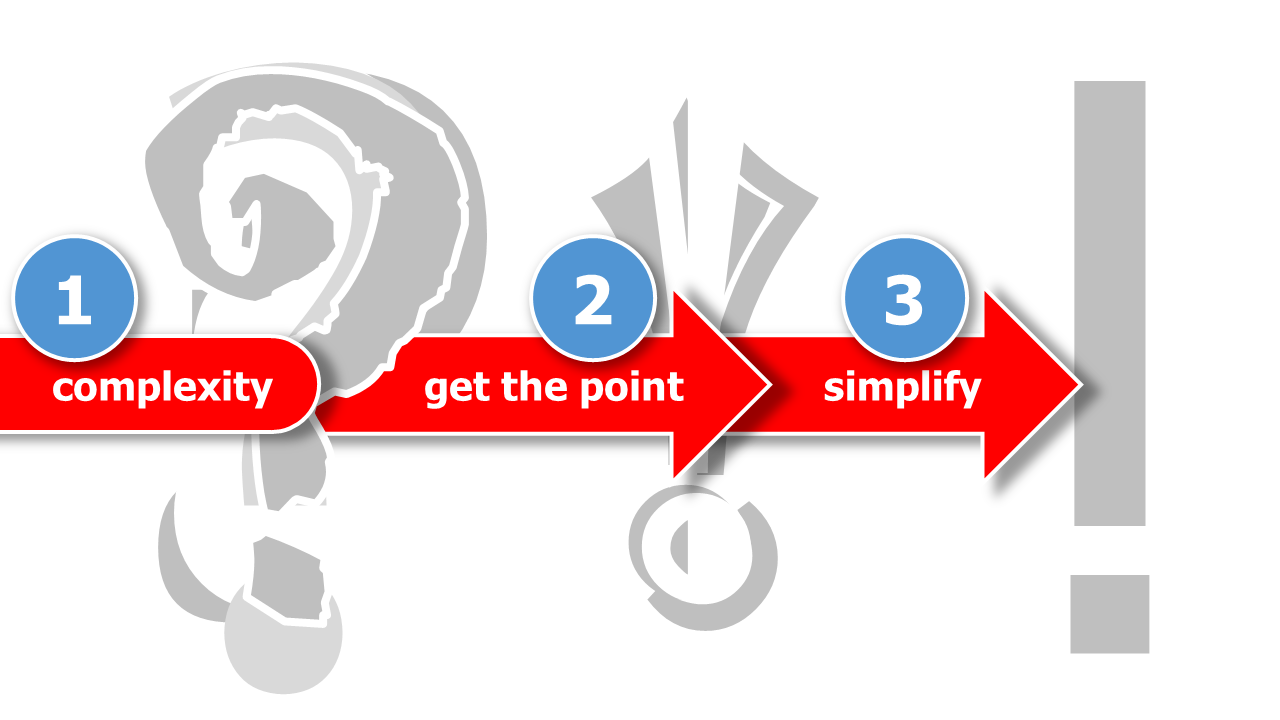
The biggest challenge in creating infographics is to understand the complex context, identify logical relationships and simplify the result.
-
Infographics usually cannot show all specific details. Often the data and processes that are the basis of the graphic are generalized.
-
Infographics must simplify certain content so that it can be quickly understood and vividly displayed.
-
Infographics work with graphic elements rather than images. They use icons and graphics as well as arrows, text boxes and colored elements.
5 Steps to an Eye-Catching Infographic ^
1. Get the Content Right ^
-
everything starts with a solid and detailed research
-
create a mind map or sketch and show relationships, hierarchies of content and above all: reduce to the most important content.
-
set up the essential contents / steps / milestones
-
focus on one aspect and one statement
2. Tell a Story ^
-
tell a story with the content: what comes first, what is the highlight and is in the center of the infographic and what is the outlook?
-
lead the viewer logically and step by step through your infographic with individual elements, data and information
-
don't get lost in the details: it is better to leave some things off if it is not so important
3. Set the Format ^
-
choose a format that is in aspect ratio 1:1 or a multiple like 2:1, 3:1, ... vertical (or horizontal if swiping left st a possibility e.g in social media)
-
cut the particular square format in half, for the areas where the individual pieces of information should be placed, so that they can be easily captured in other image formats as well
4. Organize ^
-
organize the essential information into the chosen format by drawing a sketch
-
sketch several drafts until you have the best layout
5. Create the Final Artwork ^
-
pay attention to fonts and font sizes
-
choose graphics and icons of the same type
-
keep spacing to the edge and leave enough space between elements
-
choose matching colors
Story Telling ^
Telling a good story is the essence of a good infographic. However, instead of describing and decorating the story with a lot of text, the infographic is based on quickly understandable icons, charts and graphical structures.
The One and Only Key Message ^
The viewers should be able to remember a key message with the help of the infographic. That's why there should be only one message and not several! Be critical with the content you want to present in an infographic. What is the most important message? Concentrate all your energy on identifying it. Don't get stuck in the process. Yes, as an expert you see a lot of important information and that's why it's not easy to design a good infographic. Put yourself in the situation of an uninformed viewer. What is the most important message you want to give them?
Surprise with a Single Headline ^
It is important to have a clear and easy to follow headline as your message. This should make people want to look at the infographic. If the headline presents a personal context or an exciting question or surprising statement for me, I want to know more and look at the infographic in detail. Therefore: Surprise with an unexpected headline to generate interest in your infographic.
Concentrate on the Key Point ^
Be clear that you cannot explain the whole universe of the topic. It is only about one part, it is e.g. only about one question, which is clarified with the infographic.
Guide the Viewer by Structured Content ^
In infographics, it is important that viewers are guided through the design. Even if the information, data and processes are composed in an overall design, it needs guidance and a kind graphic leadership. This leadership can come from clearly structured graphic elements as well as a sensible hierarchy of font sizes and the size of graphics. Less is more, often helps the viewer to see the structure better at a glance and to navigate well.
An infographic needs a clear introduction. What is it and why is the topic important and the result relevant? Lead the viewer from one point to the next. Show the most important connections, sequences, results. Perhaps conclude with a call to action.
Story telling often follows a fixed structure or scheme to create interest or "thrill". 3 steps can be found in good, exciting and interesting stories:
-
Everything starts with the presentation of the initial situation and an introductory conflict.
-
The action builds up to the climax.
-
After that, the grand of escalation decreases until the resolution and the explanation, the happy ending.
Less is More ^
Clear structures and only as much as absolutely necessary. This is what characterizes good infographics. They are not overloaded, but give viewers a quick overview and help further or answer a question.
Format ^
The format chosen for an infographic depends on its widespread distribution. Will the graphic be printed as a poster or must it be easily recognizable on all screens. Infographics are eye-catchers in social media and increase the click rate. But to do this, the infographics must be adapted to the requirements of the individual social media providers (which are usually different). A uniform layout that can be used everywhere is thus difficult to create.
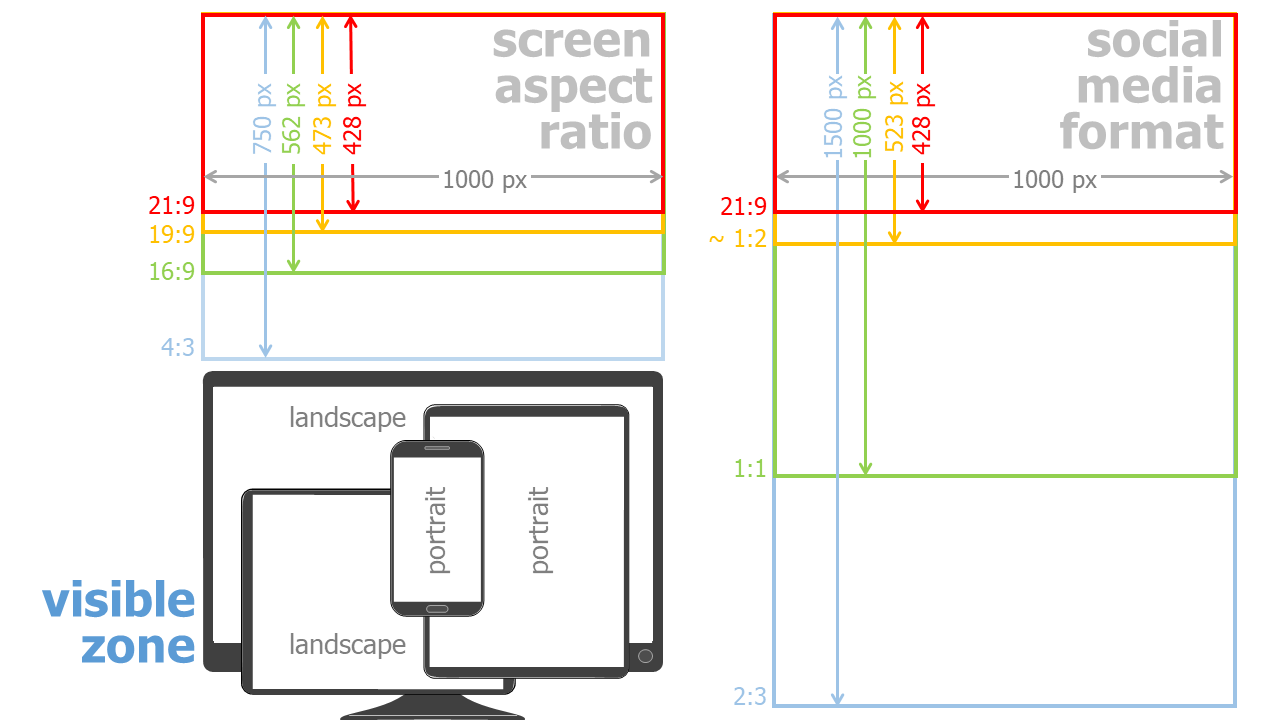
Different Screen Aspect Ration & Social Media Formats ^
Monitors and smartphone screens currently have a format of mostly 19:6. A part or multiple of a square can be used well in many areas of social media image ads. It may be necessary to leave border areas without important information so that nothing important is lost when the infographic is automatically cropped.
One Fits Most ^
Despite the variety of screen sizes and frameworks for images in social media, here is a format that meets many conditions:
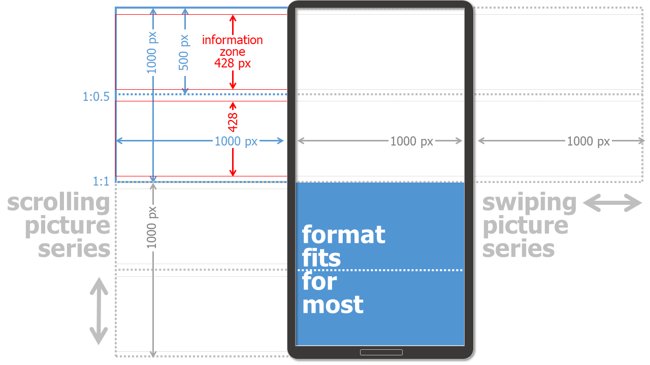
Square as Basic Grid & Half Square as Content Unit
The basic layout is a square grid in this design example. This is halved horizontally and divided into 2 individual areas. If the display allows only half a square, a coherent content must be displayed here. This also applies to the extension of 1.5 or 2 squares.
21:9 as Text & Graphic Area
In addition, the focus is placed on a 21:9 field, which contains the most important information (information zone). This system can now be extended horizontally or vertically additively. It depends on whether, for example, individual images can be better served by wiping (to the left and right) or by scrolling (down and up). Wiping is mostly only possible in social media. However, an infographic as a pdf document, for example, is difficult to operate left-right and therefore to view.
1.000 Pixels as a Unit of Measurement
Not necessarily 1.000 x 1.000 pixels (px) is the best and correct dimension for any design. Depending on the screen resolution, other pixel dimensions may be more suitable. From my experience, however, images with a size of 1.000 px are well suited and do not take up too much space to save and download.
Testing, Testing, Testing
However, it is always important to test on potential devices (smartphone, screen, printer, ...) in order to be able to judge the result correctly there.
It makes sense to perform the layout check on an user device not only with the finished end result, but already during the format selection and creative layout process.
Download Grid ^
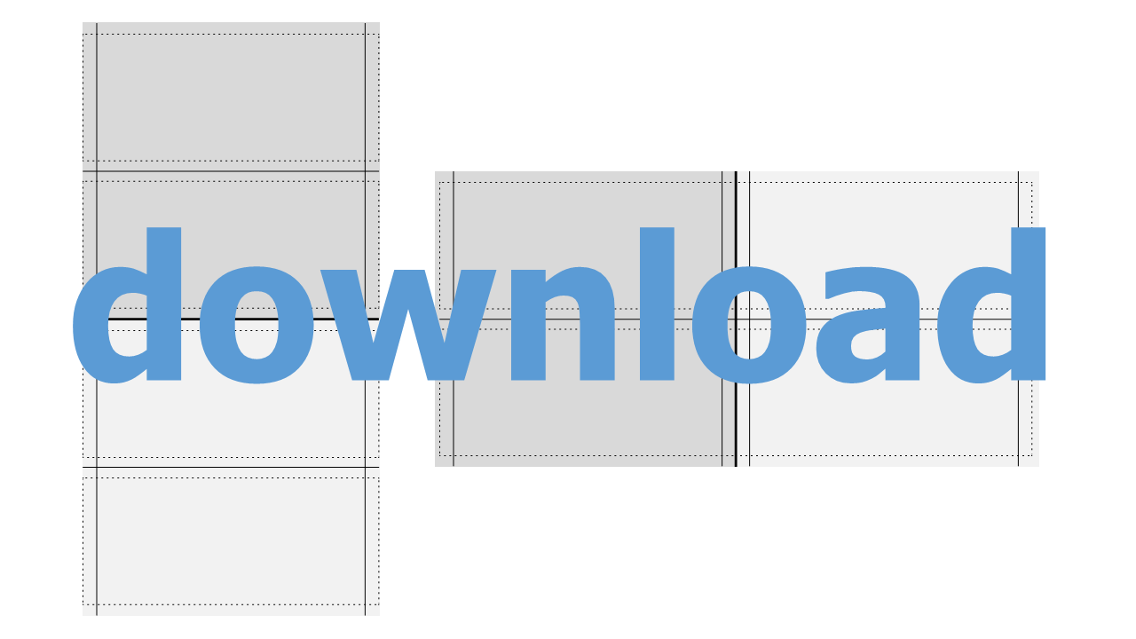
Import the grid file into your presentation software or vector program. Move the grid to the background and place text and images over it. When everything is layouted, delete the grid ;-)
Fonts ^
When it comes to fonts, you need to limit yourself. A smart layout and design will not use more than 2 fonts. If you insert graphics, make sure that the fonts of the graphics are the same as the rest of your text.
The same goes for font sizes. Here the rule is: no more than 3 different sizes. Make sure that they are different from each other. If you insert and scale graphics and diagrams with text, the font size will change too. The best thing is to make all text elements uniform: add them afterwards.
Colors ^
A consistent color scheme is what makes an infographic look professional. There are endless examples and ideas for color schemes and canvas templates on the internet.
Icons, Cliparts & Graphic Elements ^
Use uniform graphic elements and draw them yourself! Use consistent color scheme and same look. Please do not mix 2D and 3D or colored and black-and-white elements in one infographic. You can draw icons and graphic elements by hand or create them using geometric elements. However, opt for a uniform way. Use a similar level of detail in your infographic. This way your characters either have a face or none. And again: please do not mix different styles!
It is very easy to create icons and other graphic elements yourself, e.g. in presentation software or a vector drawing program. By merging or extracting basic shapes such as circles and rectangles or freehand elements, you can easily create complex shapes and elements.
Make sure that you are allowed to use all graphic elements you import into your infographic. Simply copying something from the Internet usually violates copyrights. Using a graphic element that contains a watermark (usually as a thumbshot) is also not allowed.
 | Christian Huber | 15.04.2021 |